How to build a killer credit card checkout page that converts
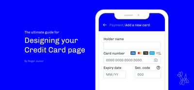
How many times have you gone through an awful checkout experience just because you really wanted to buy something? A lot of us wanted at some point to throw our cellphones in the wall with a bad-designed interface, but what I can say is that most users don’t even bother getting stressed out about it, it’s easier just to give up.
If you are designing a checkout experience, the last thing you want your users to do is leave your page before buying, especially if they went through all steps and are literally in the last interaction available on your website.
In this article, I have organized a list of tips, dos, and don’ts when designing your next credit card page. A lot of points came from an experience developing checkouts, from reading other articles, and from frustrations I faced myself or I have seen other people having trouble with.
This is a very extensive guide with a lot of details, I recommend you use this as a checklist the next time your building a new flow(or if you're revising an existing flow), but remember this is not the Bible and you shouldn't take my word as true! Feel free to make your own decisions when it makes sense.
Take a look at the Notion Template Checklist I have put together based on this article:
Designers, developers, and curious people are all welcome!
Please, sit back and enjoy :)
Present user with saved cards
Not all online stores have users frequently buying stuff. But if you have this type of behavior (or rather want to encourage your customers to reengage with your store) this would be a fantastic time-saver and friction-reducer tactic.
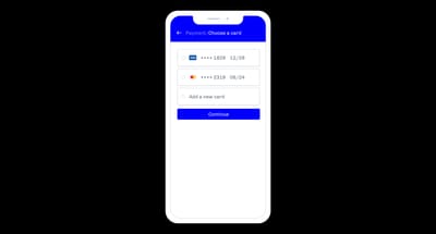
✅ DO show just a few options of the last used card. Show the last 4 digits and expiry date so users know exactly which credit card they’re choosing.
✅ DO sort them by most recent usage.
✅ DO allow users to edit their cards. Even if they can’t (for security reasons, for example), leave the option to delete a previously saved card. This will help users trust your website by letting them know they can remove sensitive data whenever they want, and also will avoid clutter with lots of unusable credit cards saved.
🚫 DON’T show expired cards. You can remove them automatically.
Here are some websites doing great:
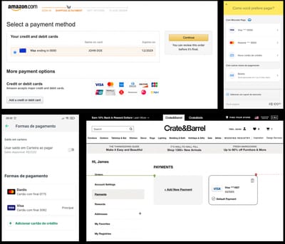
Screenshots for US Amazon.com, BR Mercadolivre.com, BR PicPay, and US Crate&Barrel showing stored credit cards.
Make it easy to fill your form
This should be a fairly easy task, but sometimes small issues with your UI can make it awfully difficult, here are some points to be looking at:
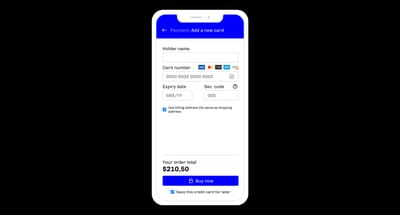
✅ DO make autocomplete/autofill available. Chrome and Safari offer the option of suggesting credit cards for users that have previously saved this data in their wallets. They will just be prompted to fill in the security code and this can save them precious time.
✅ DO allow users to scan their cards. This might not be essential and may require you to look for a third-party service that uses camera input to extract the credit card data. If you feel like it makes sense economically for the company to implement this feature, it might be worth it.
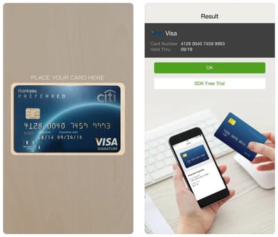
The credit card is scanned by a phone
✅ DO make the "Use shipping address as billing address" checked by default. Most buyers are also the payers and so it's very plausible to assume that both addresses should match most times. I recommend this option, especially for B2C companies dealing with individual customers, but if you're a B2B company, you might want to think about if this default option makes sense.
✅ DO let users save their credit cards for later. I would also recommend making this option checked by default, even though I understand this is a bold decision. Some businesses don't feel comfortable doing this, and for some users, this might even sound invasive. For me personally, I think as long as this data is stored safely (never store this on your own server — Payment service providers usually offer this option — , unless you are literally Amazon and have the technology and security standards necessary to do it, which is not usually the case) it's okay to do it. Again, it's your call.
Don't ask, just tell (based on the CC number)
✅ DO show credit card issuers/types accepted. This information usually comes from your PSP — Payment Service Provider (like Stripe). There's no need to put all issuers/types on the screen but you should prioritize the ones your customers use the most, especially the local ones. In Brazil, this could be Elo and Hipercard, which are issuers not very common in other countries but worth adding to the list.
🚫 DON'T make users choose their credit card issuer/type. Yes, this should be a piece of fairly easy information to get, but let me tell you: you can get this from the card number, and this information is not that useful unless your PSP actually needs it (most don't these days), so why ask for it?
✅ DO identify the credit card issuer/type based on the credit card number. Each issuer has its own pattern, so you can tell just by the card number. You can check the script with the regex for this here. And remember to check for local issuers and add them to this logic as well.
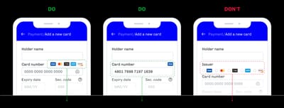
Autoformatting and validation
✅ DO format the credit card number. This is one of the most important and easy-to-implement tips here. These numbers are big (15–16 digits) so it's very easy to get one of them wrong. Creating an input mask helps a lot in this process. And there are just two rules for formatting:
- If it's AMEX, this field should have 15 numbers max and be grouped by 4–6–5 digits separated by a space.
- If it's everything else, this field should have 16 numbers max and be grouped by 4–4–4–4 digits separated by a space.
Check out this Peter Bengtsson great code on credit card number formatting. This is simple to implement, but you'd be surprised to know that half of the websites get it wrong.

✅ DO validate your credit card number even before submitting. As I previously mentioned, there are some rules for identifying the credit card number, so it's possible to live check if a number is valid or not using a library like card-validator by braintree and present the user with an error message right away.
✅ DO remove non-numeric characters automatically and use the numeric keyboard for the credit card number, expiry date, and security code. This means you should probably be using the inputmode attribute on your fields as WHATWG suggests so your user will see a numeric keyboard. But do remember this keyboard is not always available, so you still must automatically remove all non-numeric characters from user input.
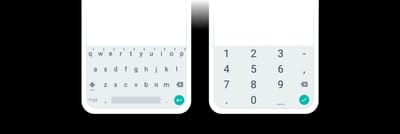
Non-numeric and numeric keyboard for Android phones.
✅ DO use placeholders on numeric fields, such as credit card number, expiry date, and security code, but…
🚫 DON’T use placeholders on non-numeric fields, such as cardholder/name and others.
✅ DO transform holder name to all caps. This is a more aesthetic choice, but I do think it helps create a better connection between your form and the user's card. Most cards have the name in all caps, and even if they don't there's no big issue with still using all caps in your application.* Pro tip here: Remember to slightly reduce the font size and increase letter spacing when using all caps, it will look so much better.*
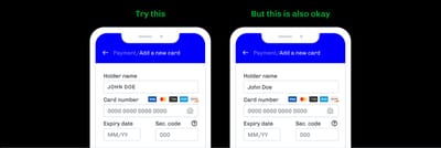
✅ DO match the input order to the credit card layout, but…
🚫 DON’T stress too much about it, as I found out that I own many cards that have a different order in information. The only thing I would say is consistent across different cards is to have your expiry date and security code in this specific order and being presented last.
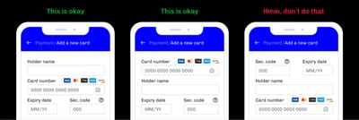
Expiry date and security code should always come last in this specific order.
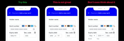
✅ DO show the MM/YY placeholder for the expiry date as default, but remember to also…
✅ DO allow MM/YYYY input as well. You find that most cards have the expiry date in the MM/YY format, but some prefer to show the year with four digits — I noticed this is a pattern common especially with virtual cards. So, don't make your user think about formatting differently, just allow both formats. It's easy to implement and your customers won't have to face an unnecessary error message.
✅ DO validate and format the expiry date right away. Notify the user if the date has passed or if it's invalid — like 13/25 or 06/2019.
🚫 DON’T use dropdowns.
🚫 DON’T EVEN THINK ABOUT using names for months.
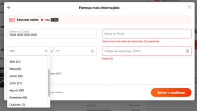
This is a bad UI from AliExpress, for the following reasons: a) They use names instead of numbers for months b) they use a dropdown interaction for expiry date c) There's no label for expiry date d) there's no active/focus state for the dropdowns — which is bad for accessibility
✅ DO validate and format the security code right away. AMEX has a 4-digit security code and all others have a 3-digit. You can check for errors based on the card number if it's already available.

✅ DO show a help section for where to find the security code. Remember to again check for card issuer/type since AMEX has the security code on the front and others have it on the back. You can show both places if the user still didn't type the card number.
Animation of a tooltip showing where to find the security code in the physical card.
Error messages and confirmation
✅ DO make error messages as clear as possible. If you know the reason why the payment was denied, share it with your user, don't make them guess. They might have mistyped the security code 455 instead of 445 and didn't even notice, or the credit card is invalid and you can check this even before submitting and warn the user. Always aim at transparency.
✅ DO make error messages local and specific to fields, and…
🚫 DON’T make errors messages generic unless you don't know what happened (or can not disclose it to the user).
⚠️ BE CAREFUL sometimes there are reasons for not being 100% transparent about why a payment was denied. If your business is keen to attract fraudulent customers, sometimes sharing that the security code is wrong is everything the fraudster needs to know. Again, this should be thought about carefully and it's your call here.
✅ DO make it clear what is the next step. If you can't share (or don't have) details about what happened, you can still leave clear instructions.
If the payment was denied, tell them that and let them know they should review their data and try again.
If it was a problem on your server, also let them know, tell them to try later, or even save their order and you can retry the payment in the back-end and let them know by email if the payment succeed or not.
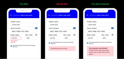
Just remember to…
🚫 DON’T make users guess. You always need to inform the user about what's happening and what they need to do next, don't make them guess.
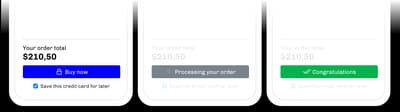
✅ DO make sure you're always sharing the current status with your user. Make your button tell when your server is processing stuff and when it's finished whether successfully or not.
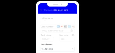
This is the place to show installment options, if available
This is easier and probably will make more sense for countries like Brazil, Mexico, Turkey, and Japan, which have the option to divide your payment in installments directly with your credit card. So if you don't have this option, you can skip this section entirely.
✅ DO show installment options. If you have interest rates applied I do think is ethical to show the final price + interest rates, something like this:
2x $110,00 — Total: $220,00
That way customers can make an informed decision about the installment count they want to choose. I would say, though, this is a very business-specific decision, so make your choice.
✅ DO show discount options, if available. Some businesses offer the option of a 5% discount in 1x payments, if that's your case, this is a great opportunity to inform this as it would work as a positive influence for the customer.
General tips
✅ DO make it easy to switch payment methods. Especially in countries where you have lots of payment options (like Brazil where you have Boleto, Pix, and bank transfer — without mentioning credit and debit cards), it is very important to make this transition simple. Even if you offer some digital wallets for payment, like PayPal or Apple Pay, users should switch easily between all of them. But remember to…
🚫 DON’T let the users leave your checkout. You probably have noticed how online stores use a different header style for the checkout page, this is for a lot of reasons, one of them is to make the user feel safer in an exclusive and secure place to make their payment, but the second and probably most important reason is to avoid user drop-out.
So I would recommend leaving the options to change payment methods, even going back to your cart, but that's it. Try to not create many exit points to avoid abandonment at this stage.
✅ DO show the final price. Your customer is usually taking price into account when making their purchase, so this is one of the most important pieces of information and you should be very transparent about it. Try to show the final price (including shipping) close to the finish button, that way they know exactly how much they're paying and they don't need to go back to their cart to check these prices.
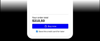
⚠️ BE CAREFUL with your microcopy. Users tend to be cautious clicking on buttons when they're dealing with money, so make sure your copy is clear and concise. Here are some tips:
If the credit card is your LAST step, try to use clear words to make the user know this is the final button.
- Try: "Buy now", "Finish", "Finish payment", or similar.
- But avoid: "Continue", "Next", "Ok", and other generic words.
Using some icon on the button may also help, a lock icon or even a dollar sign might convey the idea of a transaction. The lock has the bonus effect of showing the idea of a safe transaction.
If you still have a final revision page, try: "Review order", "Next step", or similar.
Just remember to always make it clear to your user whether the step they're in is the last one or not.
Quick rant: I almost find frustrating how easy and frictionless is to buy something on Amazon, you almost buy stuff by accident, this is, of course, amazing for their business but it makes me feel cheated in a way. You can always optimize for sales, but bear in mind that is nice to also optimize for trust.
A note about different styles
⚠️ BE CAREFUL with credit card mockups.
I have an issue with these UIs that mock up the card layout for a simple reason: there are a ton of different card designs and it is impossible to prepare for all of them.
If your customer has a lot of credit cards, they're probably used to different card designs. But you might find a lot of users have only one credit card — *especially in emerging economies with a portion of the population without access to banking services * — and might get confused if their card is purple (hello Brazillian Nubank users) and are presented with an orange card mockup.
One other issue that I find with these interfaces is that it is sometimes hard to tell where you should type your card information, or even if there's a place at all to type.
These mockups might take a lot of real estate on your application, so it might also be a great choice to leave this out of your picture.
This is not to say that you should never use this approach but I do disincourage you from doing if you are just doing because it looks cool.
I still want to use the mockups, what do I do?
It's okay if for whatever reason your application must have a card mockup, so here are some key points I would suggest to you:
- Make the credit card design match either your identity or a generic identity. This might avoid confusion caused by the divergence between the mockup and real card design.
- Use animations for the security code. As this is usually on the back of the card, rotating your mockup to show the user where to find this information might help.
- Try to automatically identify the card type/issuer, but don't go crazy with the color changes. This might work as a visual cue for your user to know that they're doing the right thing.
- Make it clear that your mockup is just a mockup and that is an exclusive place to type. This might be obvious, but sometimes it's hard to find where the actual input field is. Using a step-by-step process may help with this (but have in mind this approach has the tradeoff of being harder to correct errors.)
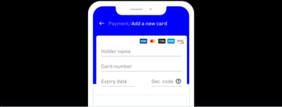
- You can also try to have the input fields laid out in a credit card like fashion, so it's not obviously a mockup but it has the resemblance that might help users fill the form:
⚠️ BE CAREFUL with using a single-line input.
This may be a cool solution, and it also might take a small real estate in your application (which is nice on mobile experiences), but I found users may have trouble correcting information if they're presented with an error.
GIF of a single-line credit card input made by Zachary Forrest
Here are some other articles that inspired me and are great resources for further reading:
- https://uxdesign.cc/the-anatomy-of-a-credit-card-payment-form-32ec0e5708bb#.3m3xc0t0s
- https://medium.com/@101/improve-your-credit-card-form-ux-16bed55df668
- https://baymard.com/blog/credit-card-form-ux-llbean
- https://www.nngroup.com/articles/mobile-checkout-ux/
- https://www.nngroup.com/articles/optional-registration/