Redesigning the Search Experience
Overview
The organization in question operates in the European Real Estate market and serves agents and investors. Their platform offers access to millions of properties, detailed comparative market analysis, and private seller leads in a matter of seconds.
Role
As a UX/UI designer for the company, my responsibilities included evaluating the usability of the Search Tool and documenting the requirements for the development team.
The problem
The main issues identified by clients were the inability to view the properties while making filter changes, and difficulty in accessing all information due to smaller screen sizes.
My challenge was to analyze and design a new layout for the Search and Filters feature, aiming on optimizing the overall agent experience.
My approach
#1 Data collection and analysis
We analyzed current platform data from Google Analytics and the internal database to gain a comprehensive understanding of the platform's current state.
#2 Prototyping
We created sketches, wireframes, and high-fidelity prototypes to develop a solution.
#3 Validation
The prototype was tested with three real clients to validate new ideas and ensure that we were on the right path.
#4 Hand-off
In the last step, we created detailed documentation that grouped descriptions, behavior, research, and prototypes for the development team.
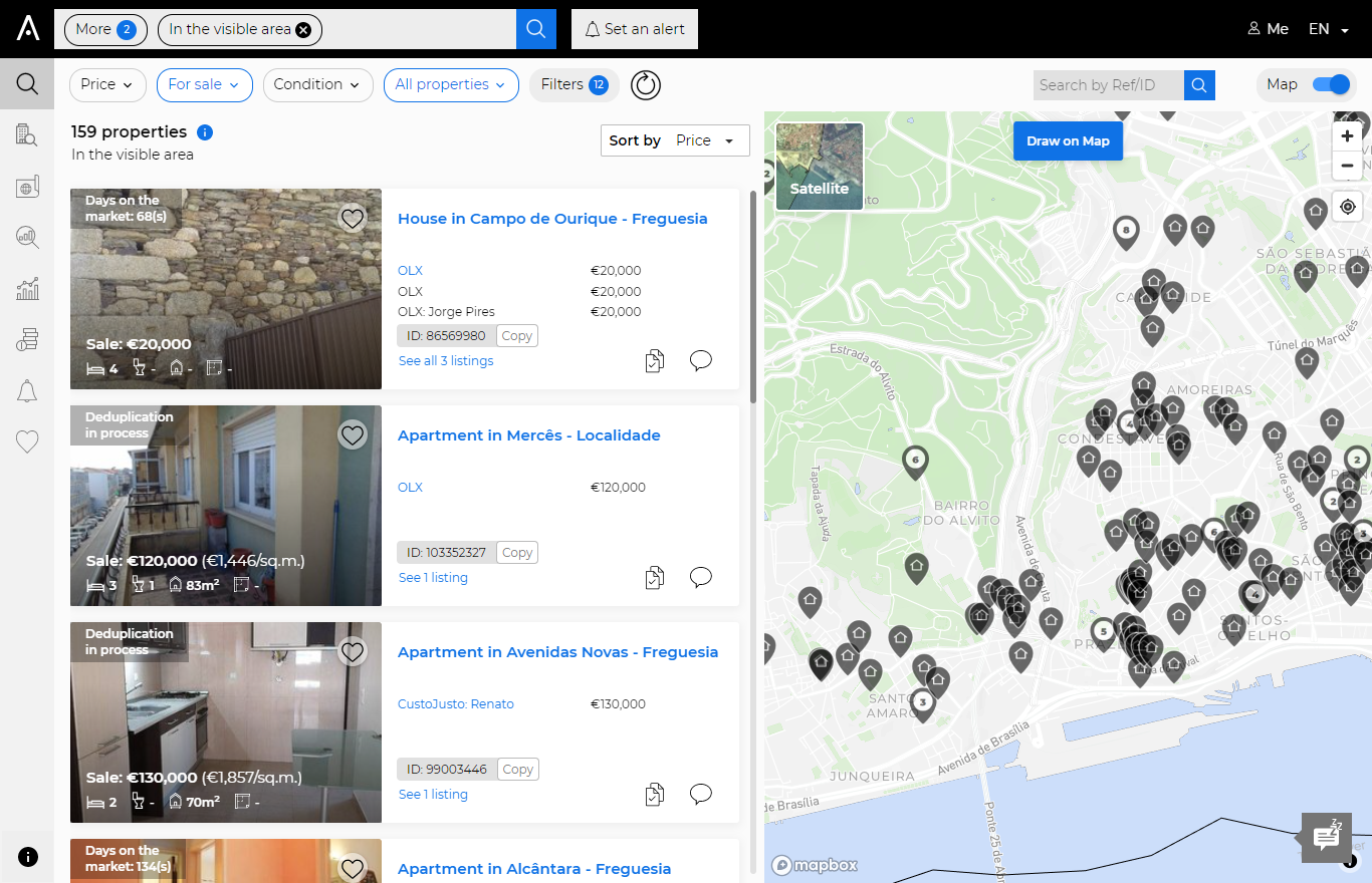
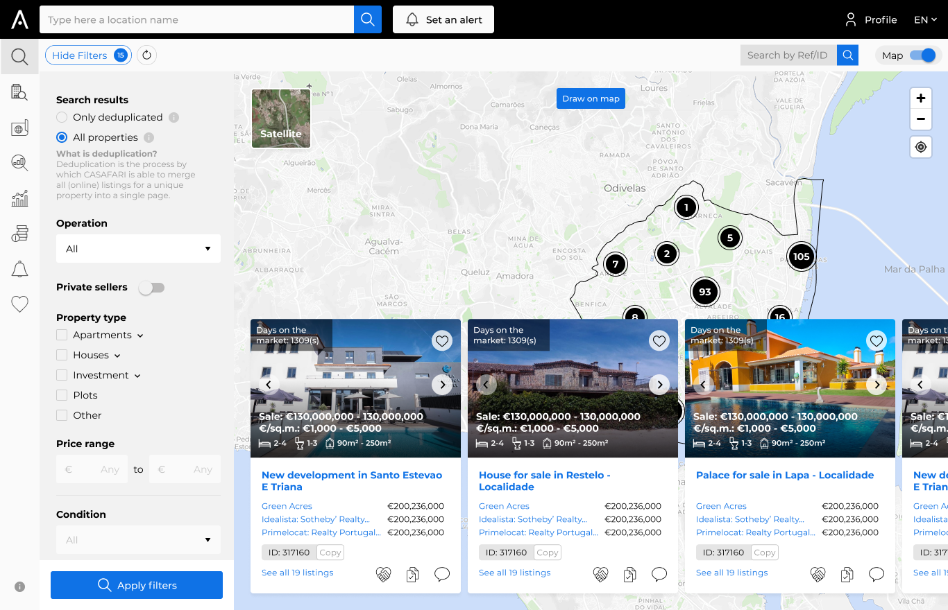
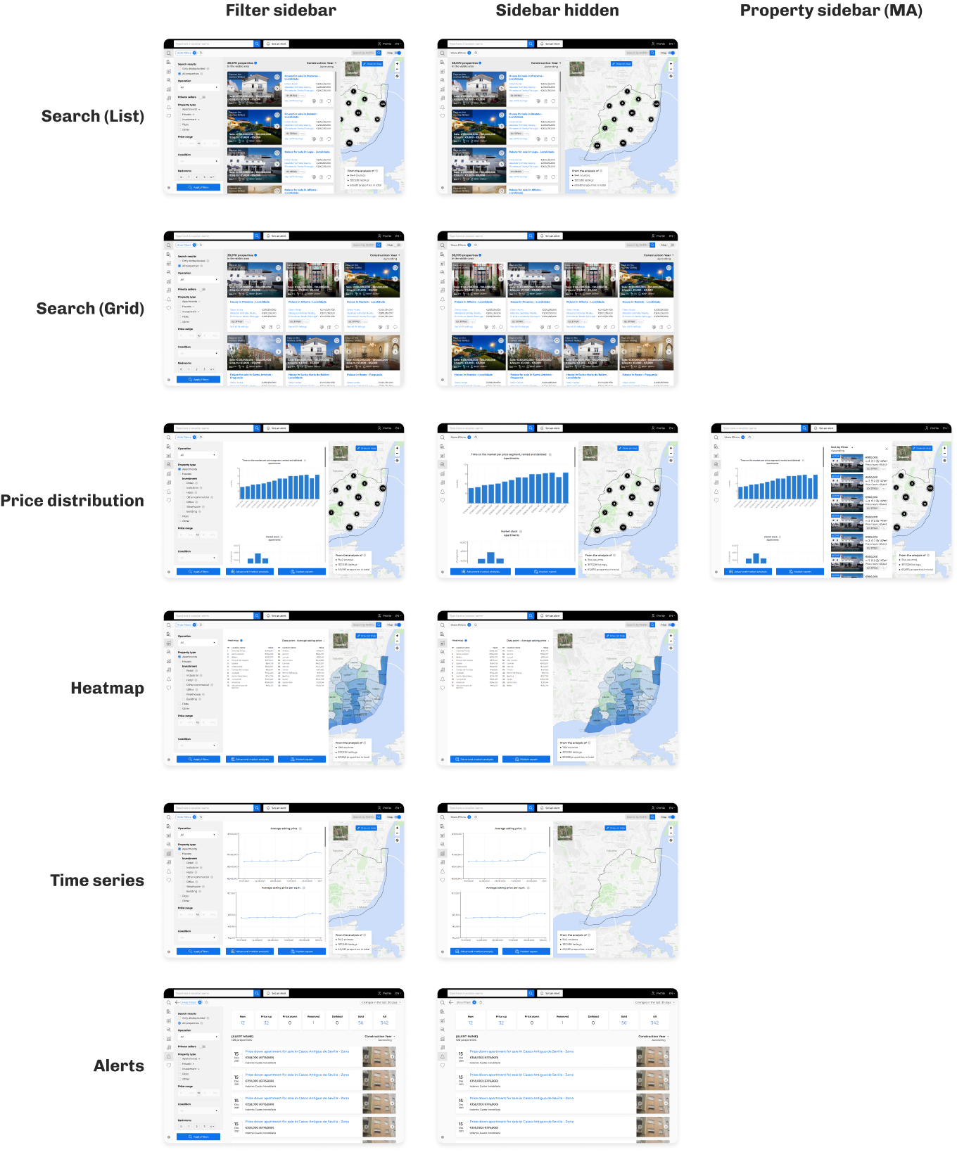
What are we starting with?
The old UI had the filters inside a button. Clicking on it replaced the Property list with the Filters list. Also, some of the filters were always visible and the topbar while others could only be seen when the filter tab was open.
Research
To begin, I delved into the UI and user behavior.
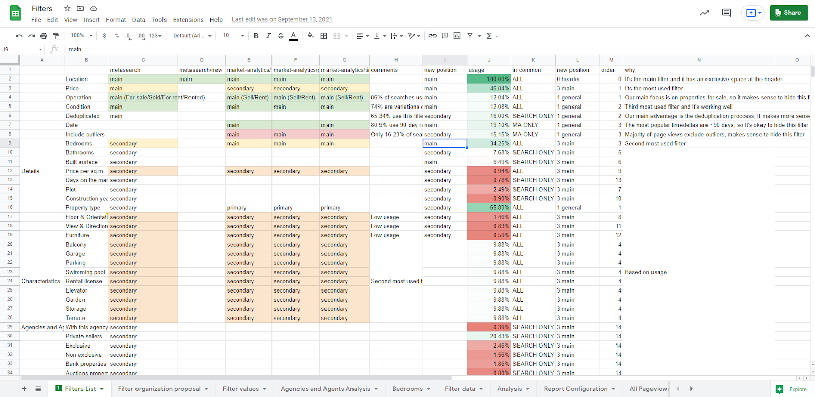
I analyzed year's worth of usage data, utilizing multiple data sources to get a comprehensive view.
With this approach, I identified areas where filters were more frequently used, which helped prioritize their placement in the new UI. Additionally, I examined more complex filters to see if any individual interactions could be enhanced. The result was a comprehensive spreadsheet that highlighted usage data for each filter field.
Making sense of the mess
Next, we analyzed the data to understand how users interacted with the search and consulted with the team, particularly Account Managers who had insight into real user behavior.
We collaborated to strike a balance between my data analysis and the clients' use cases to determine the final filter order.
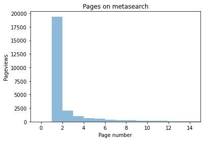
Discovering a unknown pattern
During the Research phase, I was curious to see how users interacted with the pagination and found that...
The majority of navigation happened on the first few pages.
This was contrary to our team's belief that users explored all available properties. To address this, I proposed a solution to optimize screen space and eliminate pagination.
By moving the Properties from the left sidebar to inside the map, we were able to show more properties on first sight and create more space for the Filter Sidebar.
Users who still preferred pagination could easily switch to a full view of properties, allowing for easier navigation through a large number of results.
This solution proved effective in addressing the issue and improving the user experience.
| Filter name | Usage |
| Location | 100.00% |
| Property type | 65.80% |
| Date | 19.10% |
| Deduplicated | 16.00% |
| Include outliers | 15.15% |
| Condition | 12.08% |
| Operation | 12.04% |
| Price | 46.84% |
| Bedrooms | 34.25% |
| Private sellers | 20.43% |
| Terrace | 9.88% |
| Swimming pool | 9.88% |
| Storage | 9.88% |
| Rental license | 9.88% |
| Parking | 9.88% |
| Garden | 9.88% |
| Garage | 9.88% |
| Elevator | 9.88% |
| Balcony | 9.88% |
| Bathrooms | 7.68% |
| Built surface | 6.49% |
The overall idea

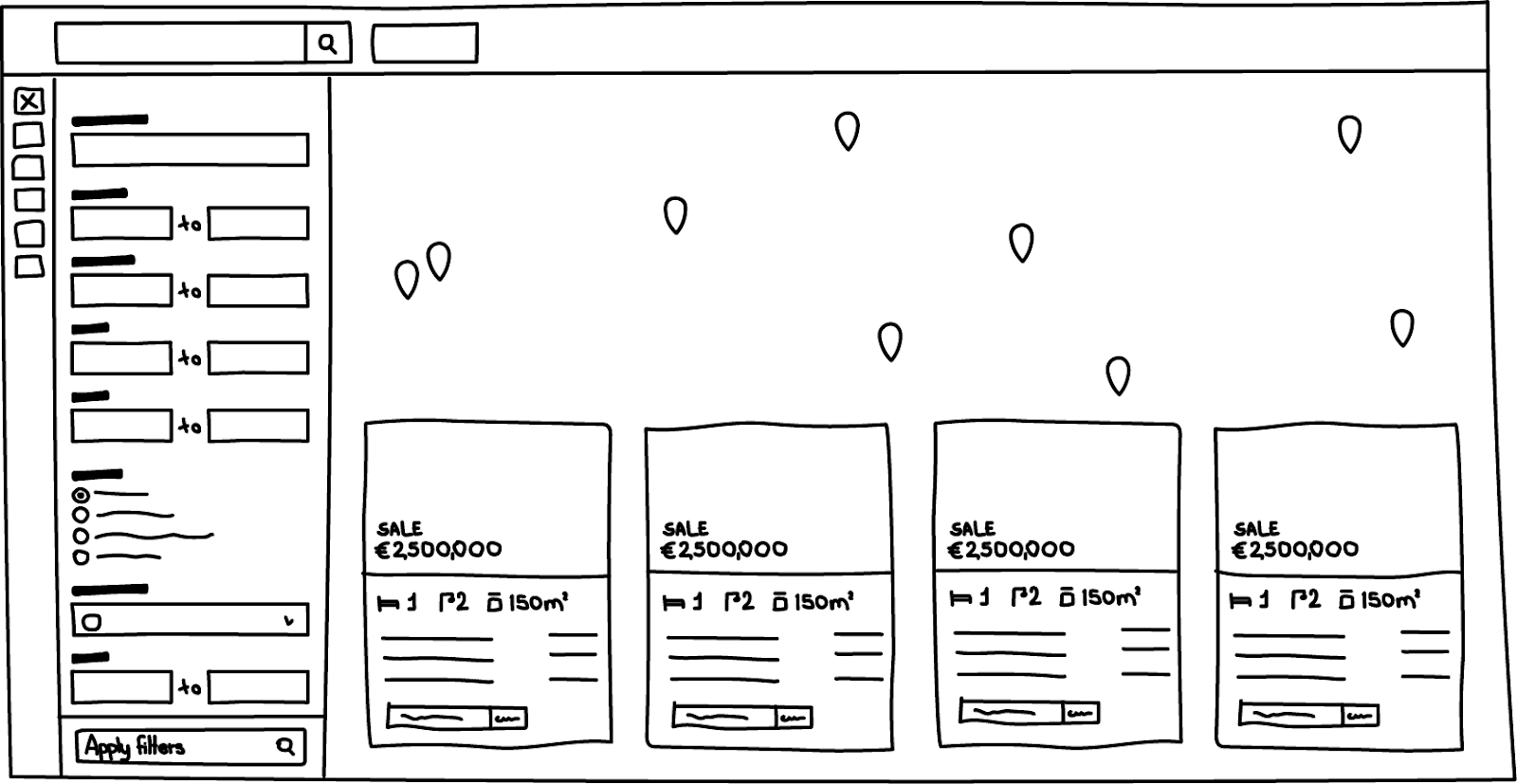
Sketches quickly turn into high-fidelity prototypes which allow me to test the ideas outside the product-team context:
User testing
We interviewed 3 active users with 5 small quests small quests for each.
The account managers assisted in scheduling sessions with three different users, during which I explained the purpose of the project and what they should expect from the prototype.
The goal of the testing was to have users try out specific parts of the UI without any guidance or instructions.
For instance, we observed that most users did not select more than four bathrooms, so I proposed a single button to select "+4 bathrooms" that would create a better layout for the majority while still permitting the smaller group to choose more than four. However, we discovered after testing that users preferred to select the exact number of bathrooms, so we added a dropdown menu to the "+4" option in the subsequent iteration.
Another finding was that users were confused by the ability to choose the number of bedrooms when they had selected "Studio" as the property type. Consequently, we prevented the selection of the bedroom option when "Studio" was selected in the next iteration.
Overall, the changes proposed were well-received, and clients were eager to see them implemented in real-life.
Time to implement
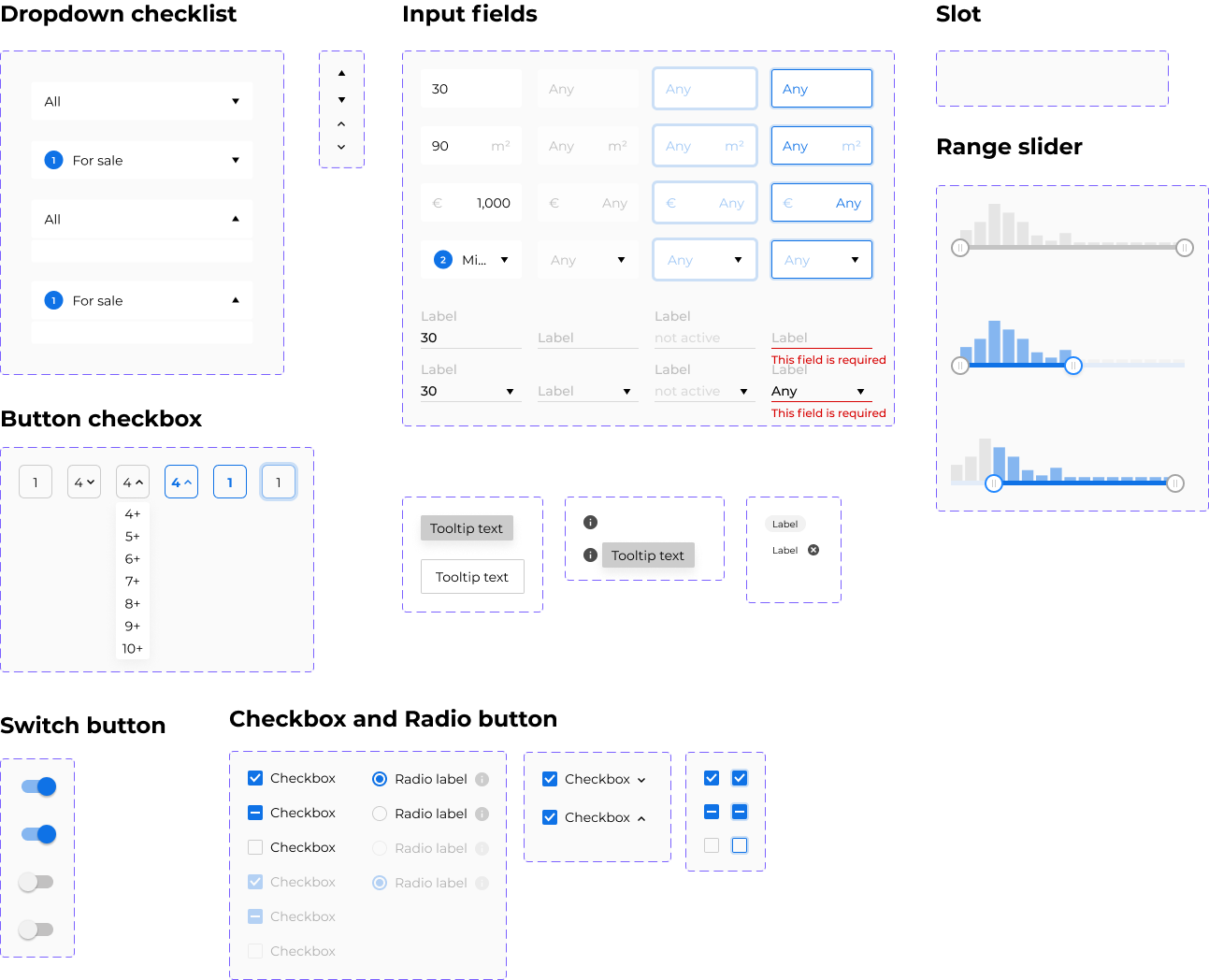
I believe in delivering designs that are easy to implement for developers. For this particular project, I ensured that the Figma files were properly structured with various states and layout options.
First step is to guarantee that Figma files are well organized with all different states and layout variations.
Take a look at this section of the project file:
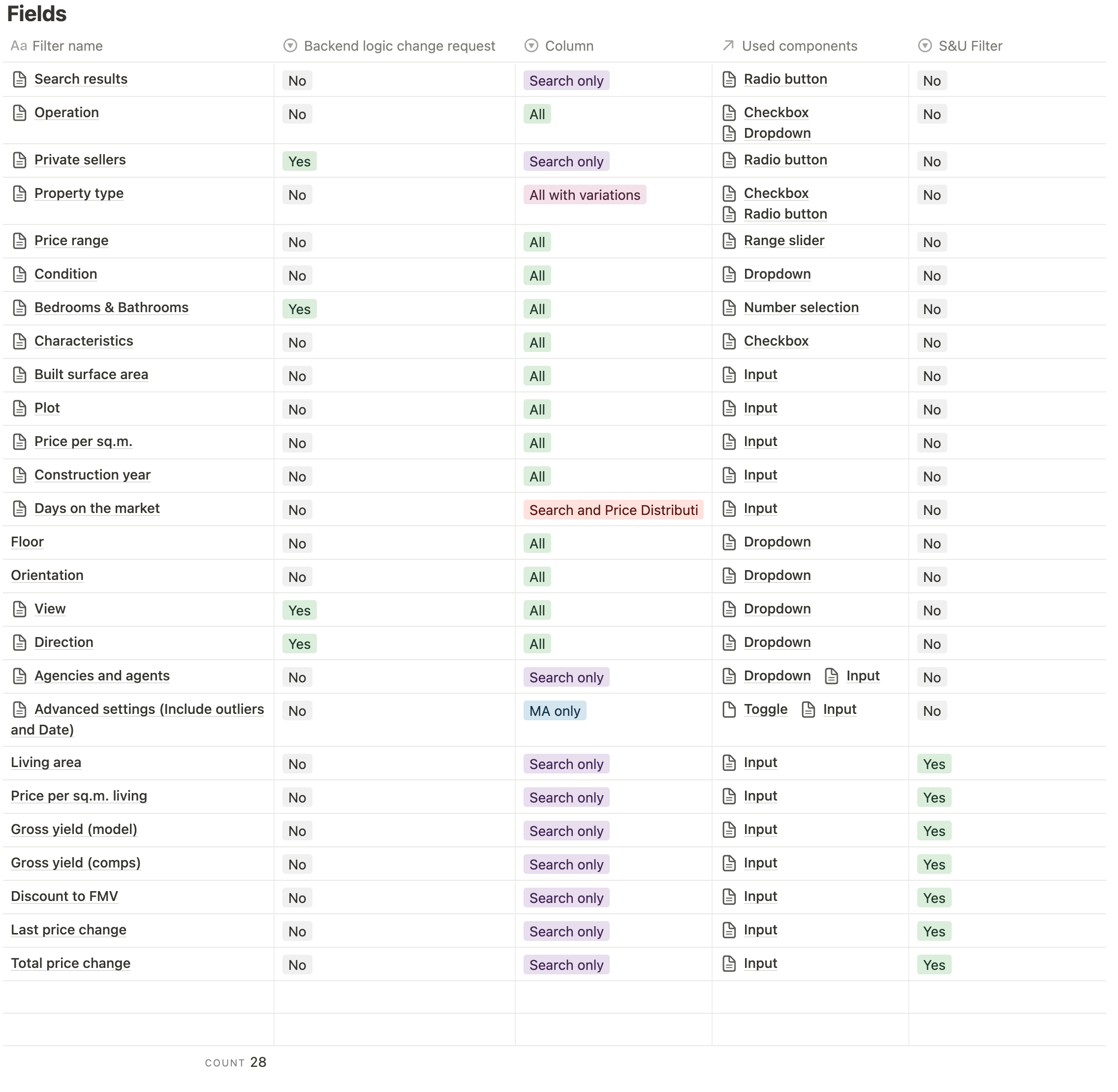
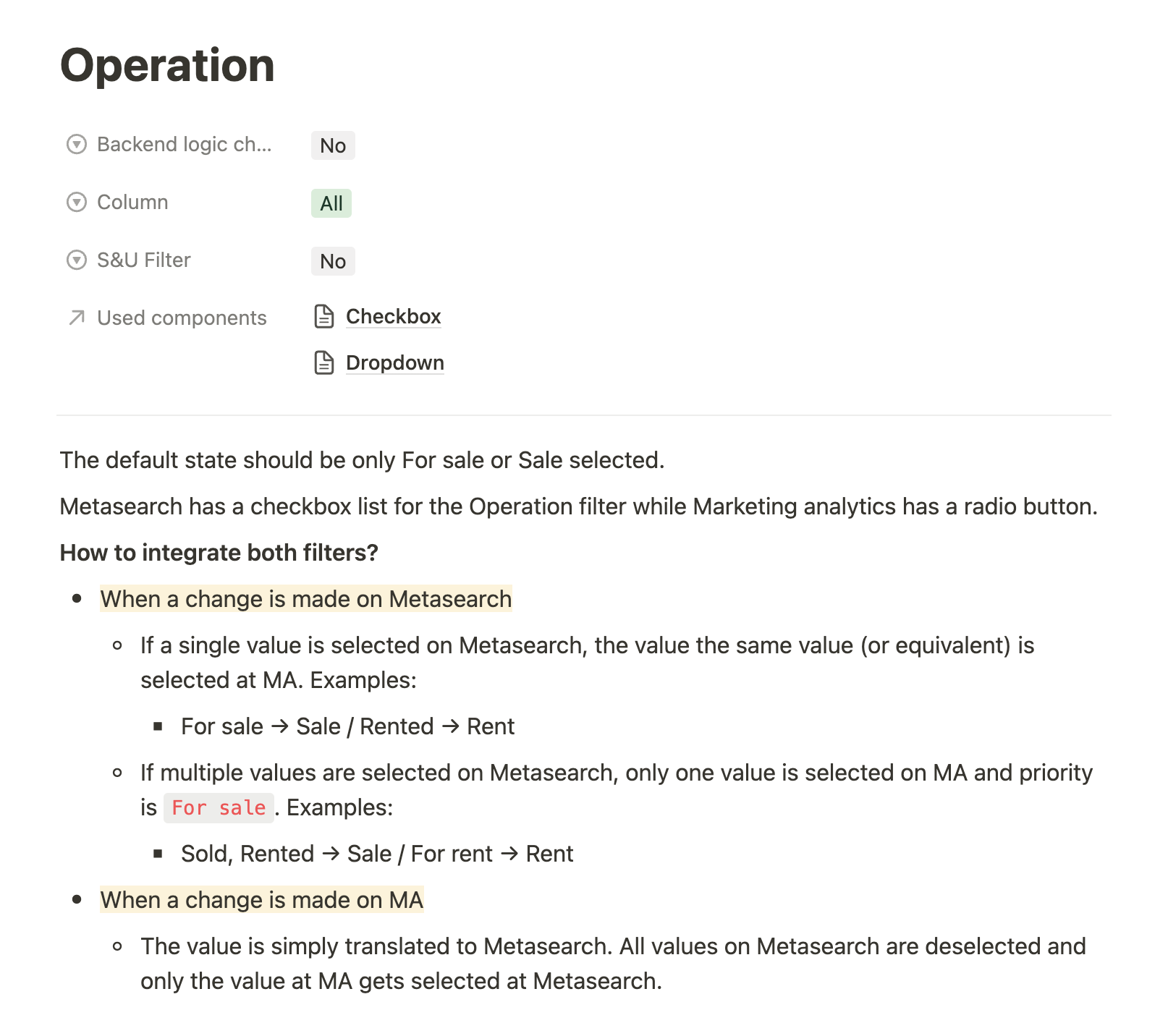
And there was also a lot of details for each filter:
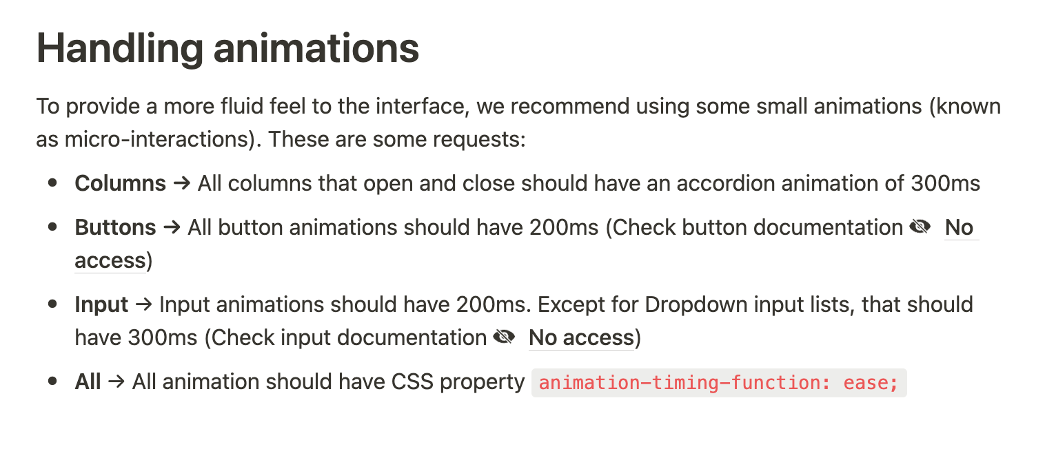
Documenting everything for the hand-off
To ensure a smooth hand-off process, I created a detailed documentation that goes beyond the prototype. I believe that having comprehensive documentation is essential for developers to build efficiently and for us to understand the problem thoroughly and anticipate any edge cases.
I like to use Notion for my docs as it allows me to create structured databases to organize the content effectively. Some of the highlights of the documentation include: