Solving problems with wrong orders by giving the customers a more intuitive platform
Overview
Dental Direct was a 3D printing company focused on the Odontology and Radiology market. With one of the most precise 3D printing technologies in dental field and more than 300 recurring customers, they really were a reference in this market.
Role
I've worked as UX/UI designer and front-end developer. In my honest opinion I did an amazing job on the UI part, but the front-end definetely needed some rework - but this was my first large front-end project.
The problem
Clients frequently created orders with wrong informations which led to losses in productivitty, material cost and delivery time.
My challenge was to create a new interface that could reduce errors from customers while placing orders.
My approach
#1 Collect and analyse data
The first step of this project included implementing trackers on the old platform to understand the user behavior before any design.
#2 Prototype
This step included some sketches, wireframe and high-fidelity prototypes to came up with a solution.
#3 Validate
After the implementation, we used the same trackers to compare the results and understand the new user behavior.
Using data to understand the problem
My first action was to install Hotjar on the old application and let it run for a month. We had an idea of what could be the reasons behind the errors but we were not sure.
I analysed the heatmaps and spent hours watching recordings to find patterns in the user behavior. This process was essential, since it gave me many insights, for example:
After watching the recordings, a figured out that users created orders with wrong products because there was a generic "Create order" button that took the user to one of the least ordered products.
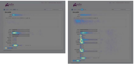
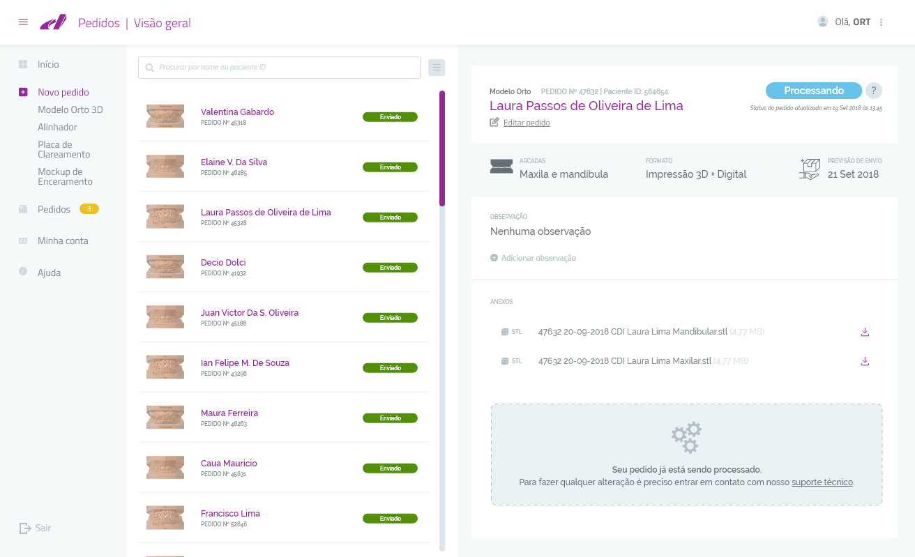
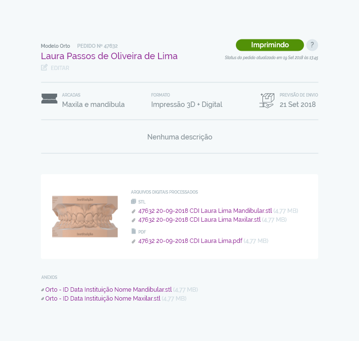
To solve this probem I decided to kill the single "Create order" button and instead use a multiple choice menu. That way users need to actively think about the product they need, reducing this type of error.
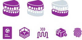
Creating icons and a more visual interface also worked as another cue to which product was being ordered, reducing errors and eliminating the need to train the clients.


The impact on user experience
After the implementation we noticed a significant redution on customer errors and overall we received a lot of positive feedbacks.
There was a improvement in productivity of the Sales team since they didn't need to train every agent, also, there was no way of a user create an account by themselves, with the new interface this was posssible and led to an increase in new sign-ups.
This project was developed using PHP and creating curl requests to the Redmine API (old platform) and we saw very significant improvements in site-speed.
| Before | After | |
|---|---|---|
| |
 |
 |
| First contentful paint | 10.6s | 2.2s |
| Speed index | 15.0s | 3.2s |
| Time to interactive | 11.4s | 4.9s |
| First meaningful paint | 10.7s | 2.9s |
| First CPU included | 10.7s | 4.8s |
| Estimated Input Latency | 10ms | 30ms |
